Water Resilience Map
WARM
Shows where and when water stress occurs, so you can act before it hurts.
The challenge
Droughts and water stress cost Europe alone around 9 billion euros a year. Yet water resilience is still assessed country by country or in small test regions. The result is a flood of fragmented maps and statistics that are hard to read, especially for the people who have to decide.
Our approach
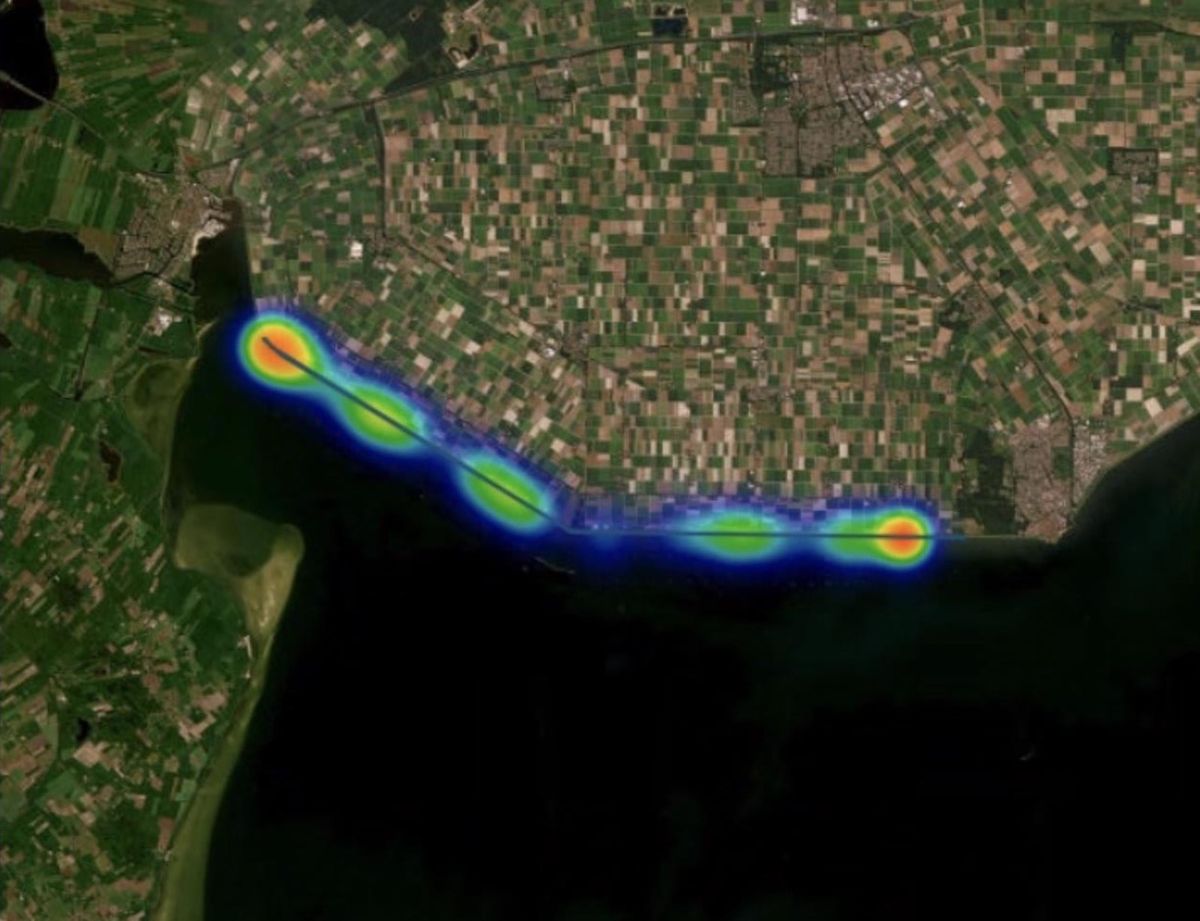
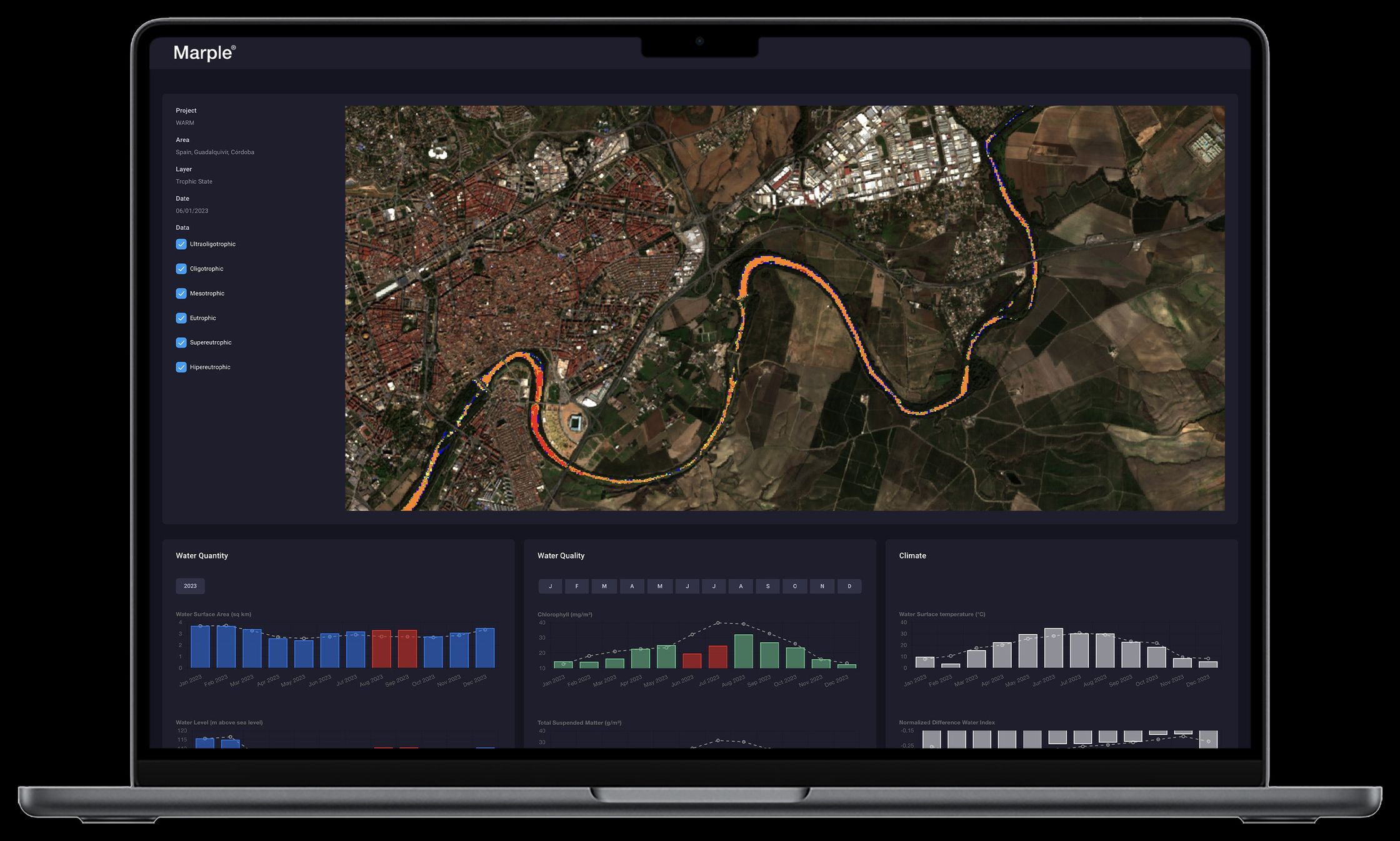
WARM reads water quantity, water quality and water temperature from satellite data, anywhere in the world, at 10 metres resolution. Then it compares every value with what is normal for that place and that time of year, and marks where and when the water deviates from the norm.
What WARM sees.
Three criteria, read from Sentinel and Landsat satellites, for any water body and any point in time.
Water quantity
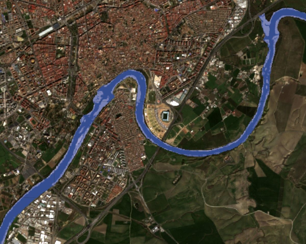
Sentinel-1 radar and Sentinel-2 optical data map the water surface of rivers, lakes and reservoirs. WARM derives the normal water level for a region and flags seasonal change and extreme deviations against the long-term average.
Water quality
Remote sensing indicators such as chlorophyll and suspended matter are translated into the trophic state of a water body. The trophic state describes its health and nutrient load, and whether the water is fit for irrigation or drinking.
Water temperature
Thermal satellite data gives the surface temperature of every water body. Rising temperatures put ecosystems, drinking water and irrigation under stress long before a river runs dry.
Not just low. Lower than usual.
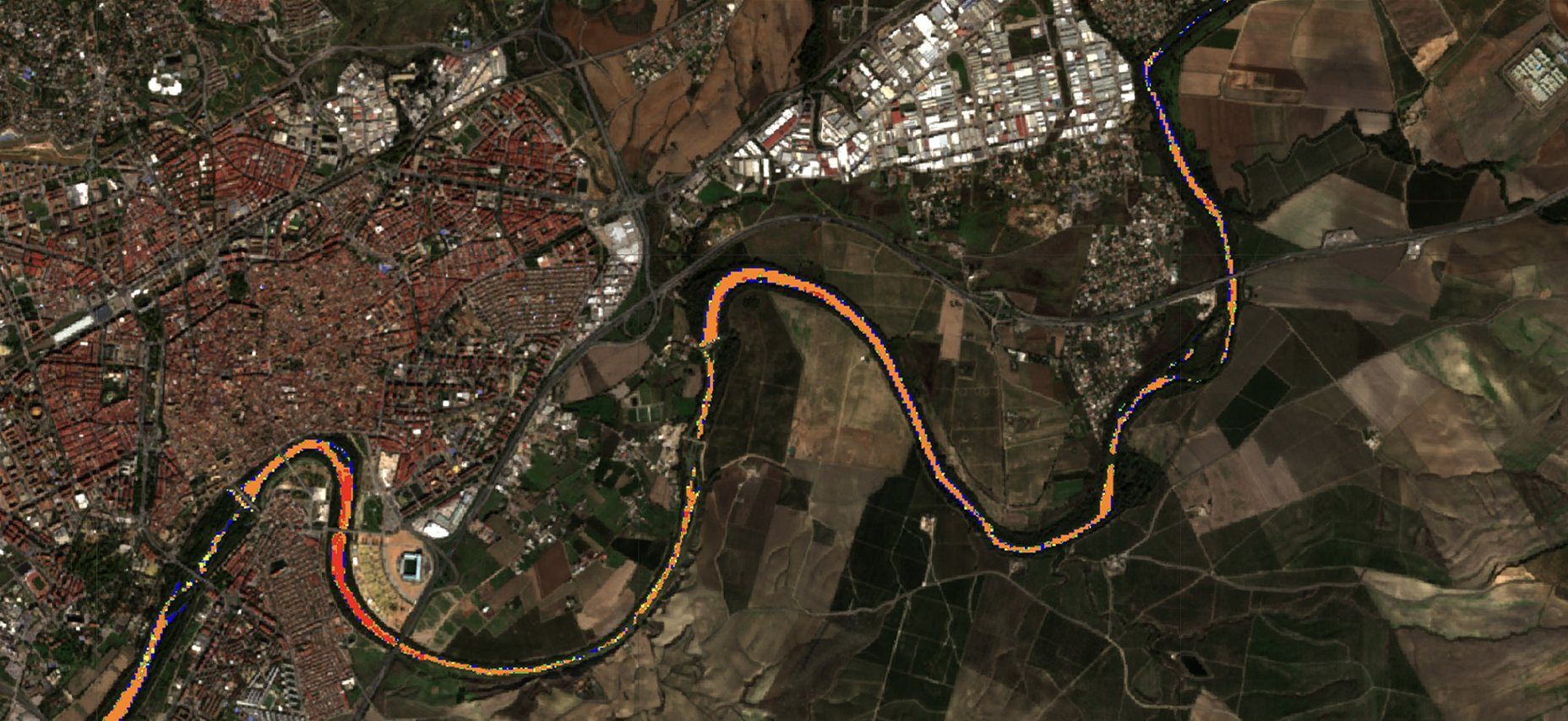
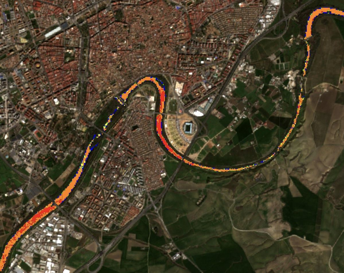
Little rain in August is normal in many places. The question is whether this August had less water than a usual August. WARM compares every value over the years and marks what deviates from the norm. You see at a glance when water stress occurred, and where.
See when
The timeline marks every month in which quantity, quality or temperature deviated from the same month in previous years. August was not normal.
See where
Click into that month, and the map shows exactly where the deviation occurred: which stretch of river, which reservoir, which fields.
Act, and check
Address the problem where it is. Later, WARM shows whether the measure worked, on site and downstream. And over the years, recurring patterns make the next stress period predictable.
Why WARM.
Water projects live on evidence. Today that evidence is collected on site, by hand, project by project. WARM delivers it from space, for every region, year after year.
One picture instead of many
Quantity, quality and temperature on one map, so a basin in Kenya and a river in Spain can be compared and explained at a glance, also by non-scientists.
Any region, any size
From a single reservoir to a whole river basin, anywhere in the world.
Cheaper than fieldwork
Satellite data is available immediately, for any region. WARM monitors permanently, at a fraction of the cost of repeated on-site surveys.
Looks back in time
Satellite archives reach back to 2015. They show what normal looks like, and let WARM assess a project that started years ago, without any data collected at the time.
Ground data welcome
Sensor readings, where available, calibrate the satellite view.
For companies
- Assessing water supply and quality at their sites
- Evaluating water projects funded by CSR programmes
- Planning irrigation strategies
- Monitoring restoration projects
For NGOs and governments
- Identifying water stress in local areas
- Analysing the impact of measures
- Validating success for funding bodies
- Visuals and data for communication
Developed in a feasibility study with ESA Business Applications in 2023–2024.
Interested in WARM?
Tell us which region you want to understand, and we’ll show you what the data says.
Daniel Lanz